
With their bold, abstract designs and carefully crafted goods, Studiowares caters to art-lovers, art-makers, and anyone who needs a little color in their life. Focused on sustainably sourced materials, eco-friendly products, and small batch releases, everything is made to order in their Los Angeles studio.
Back in 2020, a dear friend of mine reached out with a provocative proposition. She had been holding onto a collection of vintage matchbook covers, purchased over 50 years ago while travelling in Japan as a teenager. Her incredible gift came with one condition- we must “create something fun” with them. With my background in art and studio in Los Angeles, she figured I would know how to reproduce these images thoughtfully and figure out a way to share their beautiful imagery.
At the Visual Contrast studio, we immediately got to work documenting and archiving the collection. With over 1,000 designs this was no small task! A true collectable, the covers had been removed from their original matchbooks and affixed to pages in rows, a similar construct to how stamp collections are archived. The collection is over 100 years old and each image is less than two inches long, making the pages incredibly delicate and fragile. We took extra care when handling the precious covers and did our best to not compromise any of the original designs.

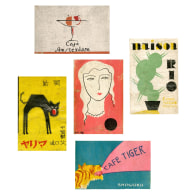
Selecting our favourite matchbook covers was quite a challenging task with so many unique and beautiful designs to choose from. Featuring both Japanese design and western Art Deco-style illustration, each matchbook cover is representative of a different cafe, bar, or business, advertising it with a playful image and an alluring tagline. One of our favourite things about the matchbook covers is their connection to time and place- each one tells its own story with just a few words and a design that can fit in the palm of your hand.
Merging the bold outlines and geometric shapes of Art Deco with symbols of Japanese culture, these matchbook covers are a mélange of Japanese tradition and Western design. Japan’s rich printmaking history established the country as a leader in matchbox design in the early twentieth century and as the advertising industry began to flourish afterwards, matchboxes became the perfect branding material. The influence of the West is clear in the typography referencing different European and American cities, as well as in the adoption of some of the ideals of the 1920s. The stylized nature of Art Deco and its focus on pattern, line, and geometric shapes lent itself well to matchbox design due to the designs having to be relatively simple to be printed so small.

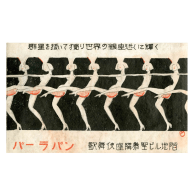
The modern girl, or “moga'', is Japan’s equivalent of an American flapper girl, representative of the contemporary style by having short hair, drinking, smoking, and challenging the social standards of the time. She is present on many of the matchbook covers, such as Horan and Parapan, advertising different bars and enticing patrons to visit. While the modernisation of Japan is evident in many of these images, there are still strong ties to its artistic history with references to different animals, which are meaningful motifs in the Japanese aesthetic. Cats have been admired in Japan for centuries and, as a result, have had a large presence in Japanese art, as shown in Cafe Maria and Black Cat Cafe. Intertwined with these different motifs are Japanese symbols of patriotism, marking their emergence as an industrial and military giant. Images of industry, such as ships, cars, and buildings, as well as rising sun illustrations establish the nation’s goals of power and growth.

Repurposing these matchbook covers into prints allows for these images to finally receive the artistic recognition they deserve. Once small and disposable, they are now preserved in history for many to learn from and admire as mementos from a time long ago. Although they date back to about a century ago, these prints are truly timeless, connecting the past to today with their graphic design and bold colour.
Shop the article


Read more

INSPIRATION
A Guide To Investing In Your Gold Jewellery Collection
Priya Faith is the founder of Umara Jewellery. Punjabi for ‘lifetime’, the...

INSPIRATION
Giving Vintage Matchbook Covers A New Life
With their bold, abstract designs and carefully crafted goods, Studiowares...

INSPIRATION
Building An Empowering Community For Women With Chloe Laws
Chloe Laws is a freelance journalist, GLAMOUR contributing editor, poet, and...

INSPIRATION
Tofu Pad Thai: An Allplants Recipe
To celebrate B Corp month this March, we’ve partnered with plant-based ready...

INSPIRATION
How To Re-Centre And Reconnect Using Movement
Saskia Gregson is a professionally trained ballerina and personal trainer....